Vactrim Light
A successful showroom rarely depends on one lighting type. Learning how to mix panels and spotlights in a showroom creates both visual comfort and commercial focus. Panels provide broad, even illumination across aisles, counters, and product displays. Spotlights add direction, contrast, and hierarchy. Together, they can guide customers without making the space feel theatrical or harsh.
Richard Kelly, a pioneering American lighting designer, wrote, “Light is the first element of design; without it there is no color, form, texture, or space.” His principle remains useful in modern retail interiors. Start with panels at a soft, consistent brightness. Then aim spotlights at hero products, textured materials, or promotional displays. Keep the beam angles controlled. A narrow beam can make one object sparkle, while an excessive number may create distracting shadows.
Test the room at customer eye level.
A practical example is a furniture showroom with 3500K ceiling panels and adjustable 3000K spotlights. The panels keep walking routes clear. The warmer spotlights make wood, fabric, and metal finishes feel more inviting. However, this balance is not automatic. Highly reflective surfaces may produce glare. Dark shelves may still look flat. Some displays may need repositioning rather than brighter lamps.
Measure lux levels, inspect color rendering, and observe the space during daytime and evening hours. A lighting plan can look perfect on paper yet fail beside a glossy cabinet. That is an important limitation. Good showroom lighting requires adjustment, not blind dependence on a formula. The final goal is simple: comfortable orientation, accurate product appearance, and carefully controlled attention.
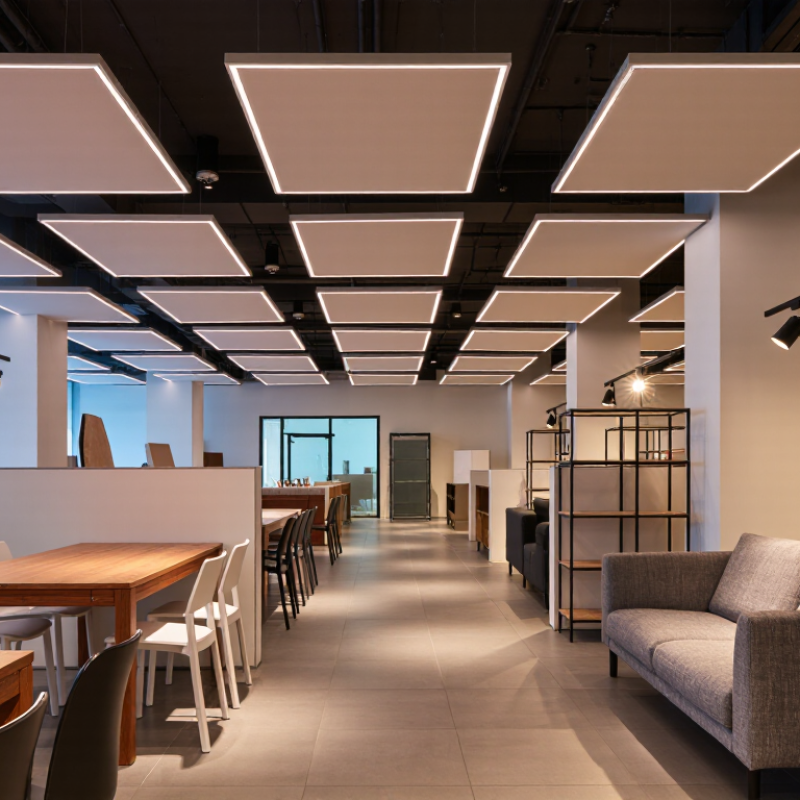
In a showroom, panel lighting should provide a calm visual foundation. Set general illumination between 300 and 500 lux, following common IES guidance. Measure this level across the customer’s walking and viewing areas. Do not measure only beneath one fixture. A bright sample table can distort the impression of the entire room.
At 300 lux, visitors can move comfortably and identify product shapes. At 500 lux, labels, finishes, and surface details become easier to inspect. Matte panels usually create softer brightness across shelves and displays. Spotlights can then add emphasis to featured products, textured walls, or demonstration areas. This layered approach prevents every item from competing for attention.
The target is practical, not magical. Dark flooring, glossy packaging, and tall shelving can change the perceived brightness significantly. I have seen layouts that measured correctly but still felt uneven near the rear wall. That result deserves review. Check glare from polished surfaces, shadows beneath shelves, and contrast between panels and spotlights. A simple lux meter helps, but human observation remains important. Ask someone to read a small label, walk through the aisle, and view products from different angles. Small adjustments to spacing or aiming often improve comfort more than adding extra fixtures.
Why Mix Panels and Spotlights in a Showroom?
A showroom needs both visual comfort and controlled emphasis. Large ceiling panels create even ambient light across walkways, counters, and product zones. Spotlights then add direction, contrast, and depth to selected displays. This combination helps visitors notice material differences without making the entire room feel dramatic. In my showroom projects, uneven lighting often made pale surfaces look dull and glossy finishes look harsh. The problem was not always brightness. It was color quality and beam control.
For color-critical displays, specify CRI ≥90 and R9 ≥50, following relevant IES guidance. CRI indicates how naturally many colors appear under the light source. R9 focuses on saturated red, which affects skin tones, wood warmth, food packaging, and certain textiles. A fixture may claim high CRI yet perform poorly with red objects. That result can surprise clients. Test it with real samples, not only a specification sheet.
Tips: Compare panels and spotlights at the same color temperature. Check red, orange, white, and metallic samples. Review shadows at eye level. Measure the installation after aiming, because ceiling height and nearby surfaces can change the result. A mock-up is worth the delay. I have sometimes trusted catalog data too quickly, and the finished display looked flatter than expected. Leave room for adjustment.
Recommended lighting specification matrix for combining broad-area panels with directional spotlights in color-critical showroom applications.
| Lighting Layer | Primary Function | Typical Beam or Distribution | Recommended Illuminance | Recommended CCT | Minimum Color Quality | Best Use |
|---|---|---|---|---|---|---|
| Panel Lighting | Provides uniform ambient brightness and comfortable visual adaptation. | Wide, diffuse distribution; approximately 90°–120° | 200–300 lx on general circulation areas | 3000–4000 K | CRI ≥90; R9 ≥50 for color-sensitive environments | Open sales floor, aisles, waiting areas, and general orientation |
| Display Spotlights | Adds visual hierarchy, highlights merchandise, and creates focal points. | Narrow or medium beam; approximately 15°–36° | 500–1000 lx on merchandise surfaces | 3000–3500 K, coordinated with the ambient layer | CRI ≥90; R9 ≥50; verify TM-30 data where available | Feature walls, mannequins, shelving, and premium product zones |
| Color-Critical Spotlight | Reveals subtle differences in reds, skin tones, wood, leather, and printed materials. | Controlled beam with accurate aiming; approximately 24°–36° | 750–1500 lx on the focal display, subject to material sensitivity | 3000–4000 K; maintain consistent CCT across the scene | CRI ≥90 and R9 ≥50; evaluate color consistency and chromaticity | Fashion, cosmetics, artwork, furniture finishes, and color samples |
| Adjustable Accent Light | Supports seasonal layouts and allows the lighting scene to be re-aimed without changing the ambient layer. | Interchangeable or zoomable beam; approximately 15°–50° | Accent-to-ambient ratio of approximately 2:1 to 5:1 | Match the surrounding lighting within approximately ±200 K | CRI ≥90; R9 ≥50 recommended for merchandise displays | Flexible merchandising, temporary displays, and changing product arrangements |
| Glare-Controlled Display Light | Maintains visual comfort and reduces reflections on glossy or glass surfaces. | Shielded or louvered distribution; aim away from normal viewing angles | 300–750 lx, adjusted for surface reflectance and viewing distance | 3000–4000 K | CRI ≥90; R9 ≥50 for color-critical products | Glass, polished metal, glossy packaging, screens, and reflective surfaces |
Reference framework: IES recommendations for visual environments, CIE color-rendering concepts, and IES TM-30 evaluation methods.
A showroom needs more than even brightness. Lighting panels create a calm, comfortable base across walkways and work areas. They reduce harsh shadows and help visitors read labels, finishes, and specifications. However, uniform light can make important products disappear into the background.
A CIBSE-informed approach adds 15°–30° spotlights for layered accent contrast. Narrower beams suit small displays, feature materials, and premium details. Wider beams work better for larger products or grouped furniture. Aim each spotlight carefully, usually from above and slightly in front. This reveals texture without throwing strong shadows onto the customer’s face.
Contrast matters. Too little contrast feels flat. Too much contrast causes glare and visual fatigue. Keep bright accents away from glossy surfaces whenever possible. Check the display from standing height, not only from the lighting plan. A sample wall often exposes problems that calculations miss.
The first layout may not be right. Move the fittings.
Measure the result after installation. Look for reflections on glass, dark corners, and distracting hotspots. Use dimming where available, because daylight and product finishes change throughout the day. In my experience, a modest spotlight level often feels more refined than maximum output. The goal is controlled attention, not a brighter room.
Why Mix Panels and Spotlights in a Showroom?
Limit Accent-to-Ambient Contrast to About 3:1 for Visual Comfort (IES)
A showroom needs both calm light and focused light. Ambient panels reveal product color, texture, and scale across the room. Spotlights add direction, helping selected displays attract attention without making nearby products disappear. The useful balance is not simply “bright versus dim.” It is controlled contrast.
IES guidance commonly recommends keeping accent-to-ambient contrast near 3:1 for visual comfort. This ratio gives featured products presence while reducing glare and harsh visual jumps. Measure the light on the display and surrounding surfaces, rather than comparing fixture wattages. A dark wall can make the same spotlight appear much stronger. A glossy cabinet can also create an uncomfortable reflection.
In practice, I begin with even panel lighting, then add adjustable spotlights gradually. The beam should shape the product, not hit visitors’ eyes. Check the view from the entrance, the sales counter, and the walking path. Small changes matter. I still get this wrong sometimes, especially around polished materials. After installation, I revisit the space at different times of day and reduce hotspots when needed. A showroom should feel energetic, but customers should not squint to inspect a finish.
Limit Accent-to-Ambient Contrast to About 3:1 for Visual Comfort (IES)
Accent-to-ambient contrast is calculated by dividing the focused display illuminance by the surrounding ambient illuminance. Keeping the ratio near or below 3:1 helps products stand out without creating excessive visual contrast.
Example values: ambient illuminance ranges from 150–300 lux, while accent illuminance ranges from 400–900 lux. Values above the 3:1 reference line may require softer spotlighting, brighter ambient panels, or improved glare control.
A showroom needs broad visibility and controlled emphasis. Panel lights can provide even ambient illumination, while spotlights reveal fabric texture, product edges, and finish quality. However, visual comfort depends on more than brightness. During an audit, measure complete fixture efficacy, not only the LED chip rating. A practical target is above 100 lm/W at system level, including optics, drivers, and thermal losses. Record readings after the fixtures reach stable operating temperature.
Glare requires equal attention. Keep the Unified Glare Rating below UGR 22 in key viewing zones, especially near mirrors, polished surfaces, and seated displays. Use a calibrated illuminance meter, fixture photometry, and a room layout reflecting real installation conditions. Our first assessment missed a reflective countertop, which made the space feel harsher than the software prediction. That small mistake changed the aiming angles and fixture spacing.
Tips: Check efficacy at the intended color temperature and dimming level. Review UGR from several customer positions, not one central point. Aim spotlights away from direct eye lines, and use panels with controlled luminance. Leave a few test products in place during commissioning. Empty rooms can mislead. A showroom may pass the numbers yet still feel tiring after ten minutes. Record both measurements and observer feedback before approving the final lighting arrangement.
Ceiling panels provide even light across walkways, counters, and product zones. Spotlights add direction, contrast, and depth. This balance helps visitors notice textures without making the whole room dramatic.
Choose lighting with CRI of at least 90 and R9 of at least 50. High CRI alone may not show saturated red accurately. Test wood, fabrics, packaging, skin-tone colors, and metallic samples.
R9 affects saturated red and warm colors. It influences skin tones, wood warmth, food packaging, and certain textiles. A display can appear dull when its red rendering is weak.
Use 15°–30° spotlights for layered accent contrast. Narrow beams suit small displays and detailed materials. Wider beams suit larger products or grouped furniture. Aim them from above and slightly forward.
Keep accent-to-ambient contrast near 3:1 for visual comfort. Measure light on the product and nearby surfaces. A dark wall or glossy cabinet can make the same spotlight feel much stronger.
Avoid aiming bright accents directly at glossy surfaces or visitors’ eyes. Check reflections on glass, polished cabinets, and metallic finishes. View the display from standing height. Visitors should not squint.
Yes, create a sample wall or mock-up before final installation. Compare panels and spotlights at the same color temperature. Check red, orange, white, metallic, and textured samples. Test real products.
Measure the finished installation after aiming each fixture. Inspect the entrance, counter, and walking path. Look for dark corners, hotspots, facial shadows, and glass reflections. Move the fittings.
Not usually. Moderate spotlight output often looks more refined than maximum brightness. Use dimming when available, because daylight and product finishes change during the day. I sometimes trust catalog data too quickly, and the finished display looks flatter than expected.
A successful showroom lighting plan combines broad panel lighting with focused spotlights to create both comfortable visibility and visual hierarchy. The key to understanding how to mix panels and spotlights in a showroom is to begin with general illumination of approximately 300–500 lux, providing an even foundation for movement, browsing, and product recognition. For color-critical displays, select light sources with a CRI of at least 90 and an R9 value of 50 or higher so colors and saturated red tones appear naturally.
Once ambient lighting is established, add adjustable spotlights with beam angles around 15°–30° to highlight featured products and create layered contrast. Keep accent lighting close to a 3:1 ratio compared with ambient light to maintain visual comfort rather than harsh glare. Finally, review LED efficiency, aiming for performance above 100 lm/W, and manage glare to remain below UGR 22. This balanced approach improves product emphasis, energy performance, and the overall visitor experience.